You never know when inspiration will strike. In this case it struck in a conversation between friends in 2009.
I’ve always been a bit of a cartography geek, and my thesis in college was about how visual and written communication together convey information more effectively. So when I started a tiny design studio in the late aughts and a friend kicked off a conversation about passion projects simply for the joy of making, I began merging those interests with my fascinations with history — and conflict.
I was raised idolizing my dad, who was born in 1942 and whose life was literally shaped by war. His father served in the Pacific Theater of World War II for much of his early life; his brother served the army too; his early career was designing nuclear reactors for naval submarines. Books in the guest bathroom detailed “The History of Tanks” and “Air Combat of the 20th Century.” I watched jingoist Looney Tunes episodes of “gremlins from the Kremlin” disassembling German bombers over breakfast cereal — stuff my dad watched when he was a kid, too.
But as I grew up, my view expanded. I saw the devastation of war. In college, I shot photos for our student newspaper of anti-war protests as America flew its troops to Afghanistan and Iraq. I had friends in war zones. I read Howard Zinn’s clear-eyed history lessons showing, tale by tale, how power corrupts, driving despots to steamroll over populations in search of dominance. I saw how intertwined conflict was with the very fabric of our societies, and some of the darker sides of humanity.
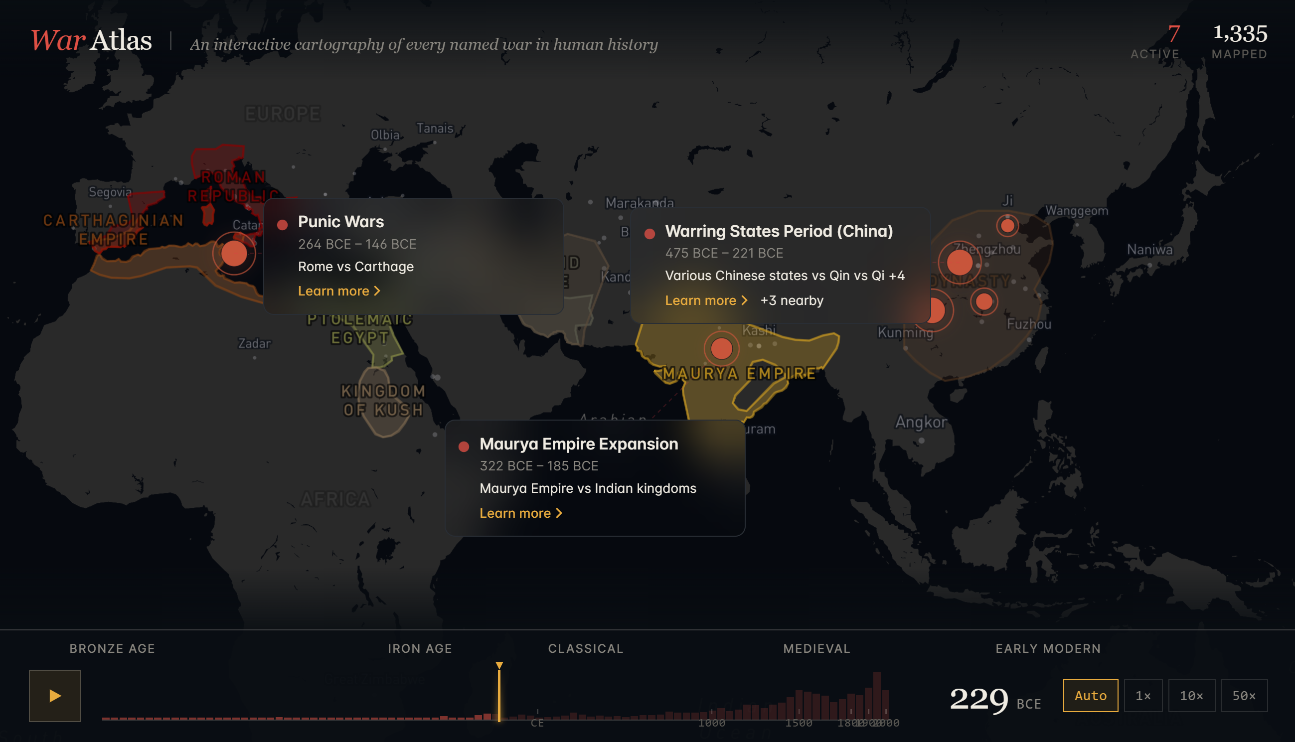
War is devastating, and it drives the rise and fall of entire empires. So much of who we are has been forged by war over millennia, through dark ages, despots and death. I wanted you to see that play out over a map, and be able to scrub back and forth over a timeline to watch it happen before your eyes.
But in 2009, I couldn’t figure out how to make it. I never quite had the right knowledge, tools or patience to wrangle the code, the geographic data, the research. So I sat on it. Until now.
Over the past couple of months, working nights and weekends with Claude Cowork, I made www.waratlas.org.
I think of War Atlas less as a design exercise (though I did obsess over the design here and there) and more as the alpha version of a pet interest by a history buff and anthropology nerd who… finally got around to a project that’s been rattling around in his head for a decade.
Under the hood, War Atlas pulls from a stack of public domain and openly licensed sources. Coastlines come from Natural Earth. Peer-reviewed era borders come from the historical-basemaps project maintained by André Ourednik. Lead summaries and citations come from Wikipedia. And where the open data ran thin, I traced polygons vertex by vertex from Cambridge atlases, Britannica historical maps, and Talessman’s Atlas of World History. The current dataset covers 1,340 named conflicts, 372 empires with shifting borders, and roughly 700 historical city-name records that fade between names as you scrub the timeline (Byzantium becomes Constantinople becomes Istanbul, and so on). Along the way, Claude helped me wire it all up as a Next.js and React app, with Mapbox GL JS rendering the maps, TypeScript keeping things from falling over, Tailwind for styling, and Vercel hosting the whole thing… and honestly, though I know what those words mean, I couldn’t tell you the first thing about how to do them. Claude just let me build.
Accuracy was (and still is in pockets) the hard part, and the place where working with an AI collaborator could go very sideways if you weren’t paying close attention. About 40% of the empire borders are pinned to a canonical source and drawn as solid polygons. The rest are best-estimate approximations right now, and the map shows them as dashed outlines so you can see at a glance which is which. I built a validation pipeline that rejected any border match where the centroid drifted more than 15° from a known anchor, where the area was off by more than 5x, or where the source map’s year fell outside the polity’s actual lifespan. That alone caught some near-misses worth laughing about: the Qin Dynasty got matched to the Qing Empire (off by 2,000 years), Kyivan Rus got matched to Cyprus, Song Northern got matched to Songhai. Plenty of those would have shipped if I’d trusted the first pass.
A lot of the actual work was pushing back on Claude when something felt off. Numbers that looked too clean, for example, or casualty figures presented as a single number when the historiography is a wide range. A polygon that suddenly extended across an ocean it had no business crossing. An “obvious” Wikipedia article that turned out to be a different polity with a similar name. I got into the habit of asking for the source on every factual claim, then re-verifying against a second source before letting it into the dataset. The /sources page in the app lists every dataset, every license, and the known caveats. The goal is for a reader to trust the things marked accurate, and to know exactly when they’re looking at an approximation.
War Atlas is far from done. As pet projects go, you end up finding things to tweak on almost a daily basis. But I’m excited to put it out into the world to see how it might help visualize a very real part of our past, peeling back some of the abstraction and showing the push and pull of conflict on societies over millennia. If you also geek out about historical data, cartography, or conflict studies, I’d love your feedback on how to make it even more interesting.